


This project focused on redesigning the Passafree mobile app to improve usability and deliver a more intuitive experience for event-goers in Cabo Verde. Grounded in a user-centered design approach, the goal was to rethink key user flows and ensure the app better reflected the real needs and behaviors of its users. The redesigned version was later documented and used as my bachelor’s thesis.

Passafree is a digital platform for event discovery and ticketing, available on iOS, Android, and web. Its first version was developed quickly and launched without formal user research, relying on firsthand insights from early customers. While this approach allowed the team to move fast, it led to usability issues, including limited filtering, unclear navigation, and a confusing purchase flow.
“Passafree 1.0 was born from real-life hustle, not formal research. I listened to complaints from neighbors, friends, and Facebook clients. We had to move fast. There was no time for testing, we just had to ship it.” — Guitta Ortet, Co-Founder

These challenges revealed a clear opportunity to improve the product through structured research and inclusive, iterative design. Apply user-centered design to validate assumptions, improve usability, and deliver a scalable, inclusive event discovery experience for users in Cabo Verde.

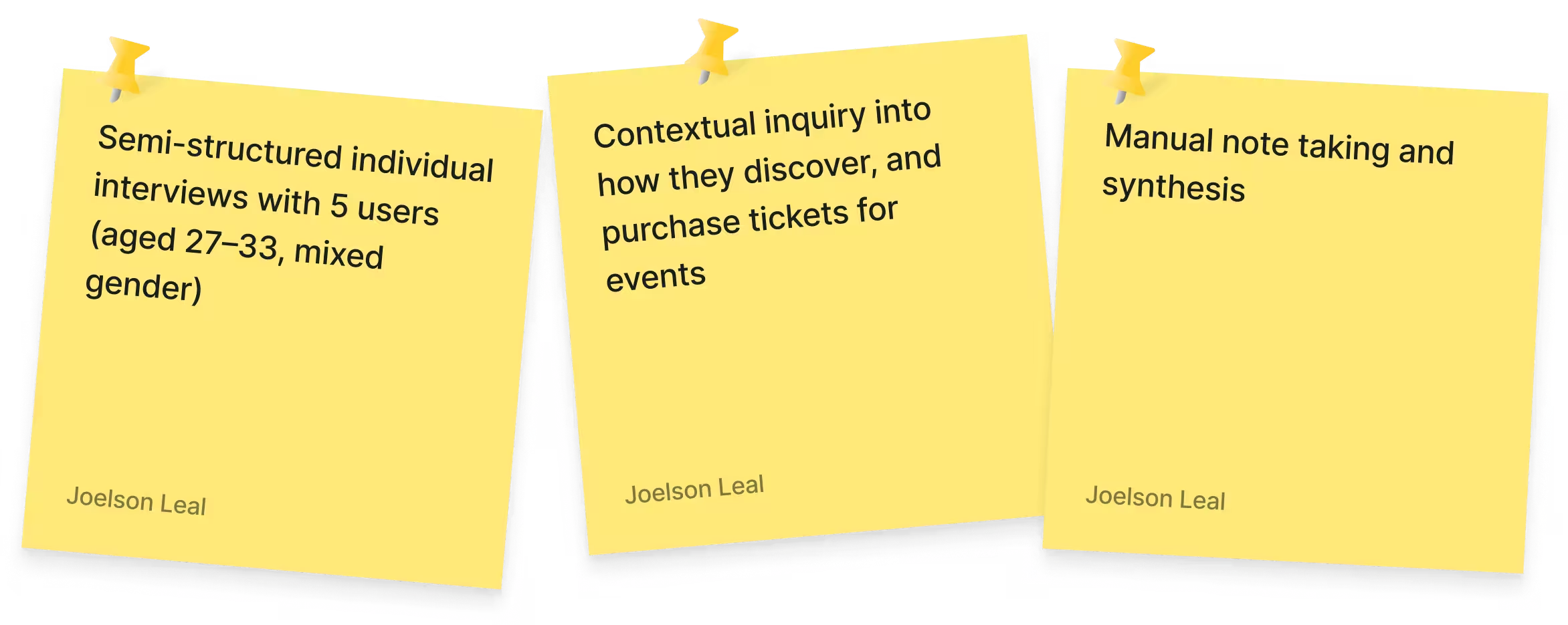
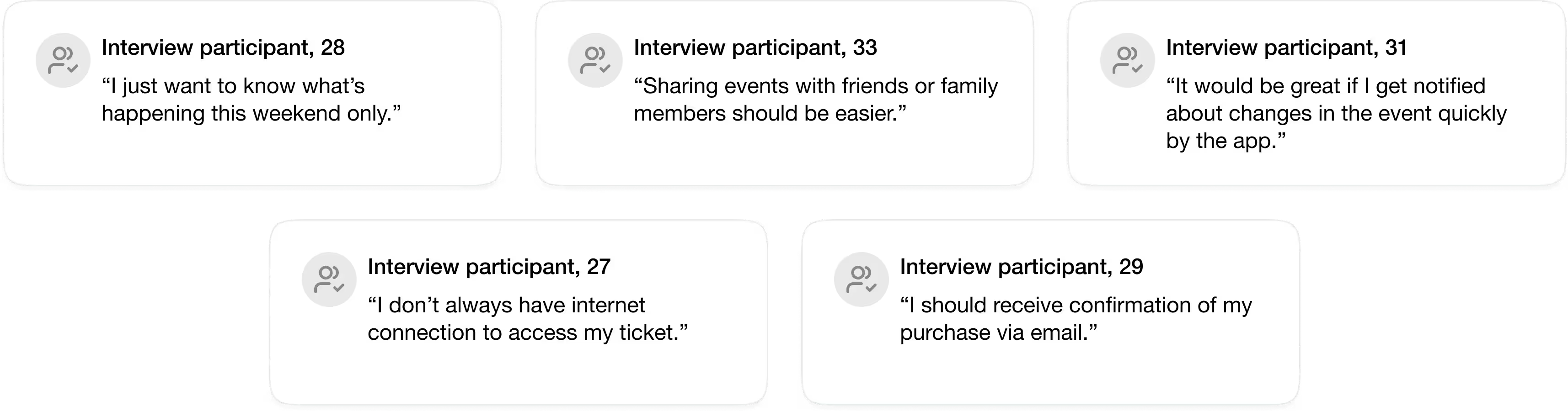
To better understand user needs and everyday usage, we conducted five semi-structured interviews with existing Passafree users aged 27 to 33. We invited some of the existent users to participate in the research Although the target audience was known, it was crucial to explore their behaviors and expectations in depth. Each session lasted 20 to 45 minutes and focused on how users discovered, bought, and shared event tickets. These conversations revealed 20 distinct user needs, including both expressed and unspoken frustrations, which informed the design of Passafree 2.0.

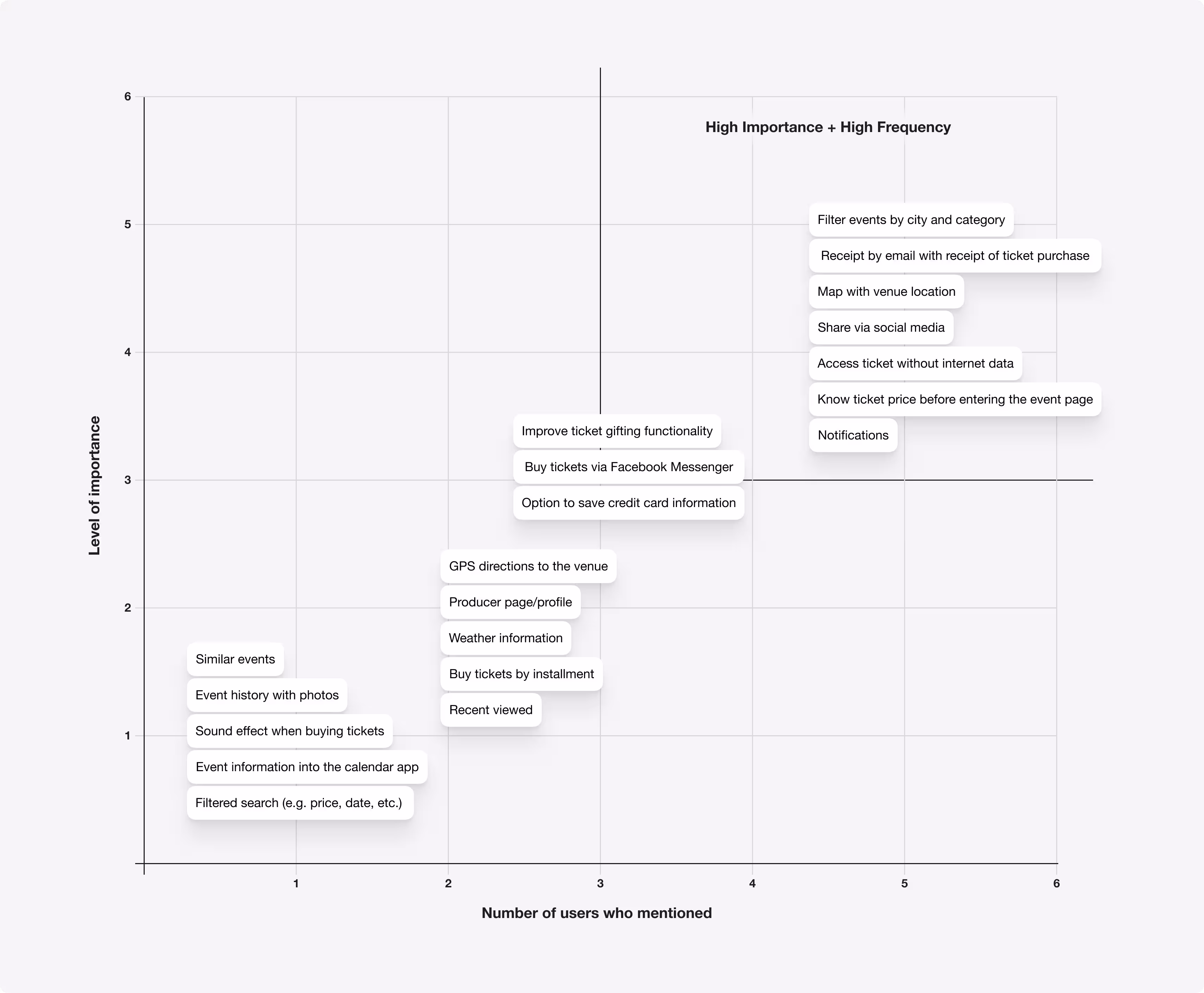
After collecting and organizing the 20 user needs, we moved into the analysis phase to determine which features should guide the redesign. Using a dual-criteria framework, based on the number of users who mentioned each need and the level of importance they assigned, we grouped the needs into four priority levels: A, B, C, and D. This helped us distinguish between critical usability requirements and optional or low-impact suggestions.
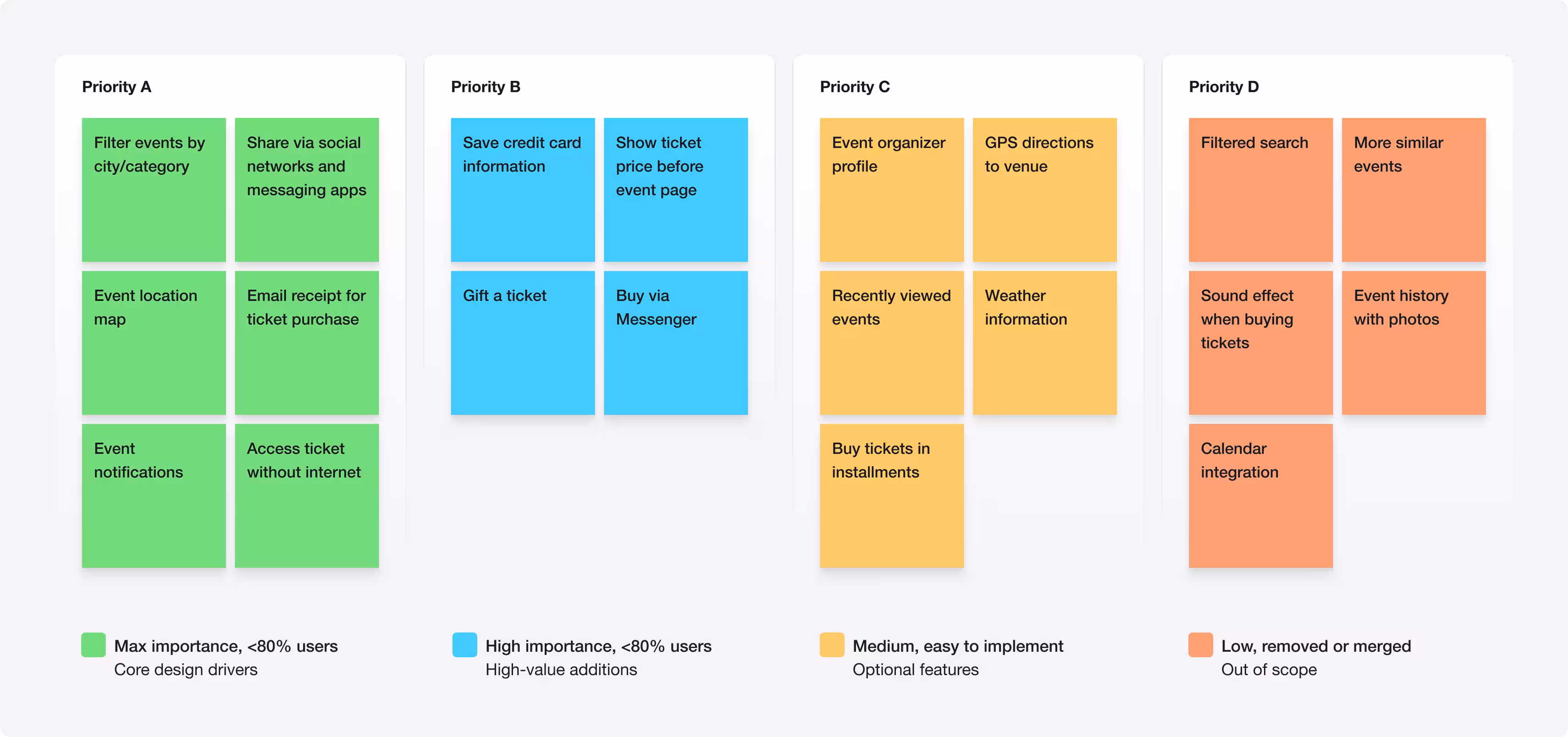
To validate the prioritization, we held a final review session with all five participants. Through group discussion and mutual agreement, four needs were removed due to feasibility constraints or existing native solutions, and others were merged. This collaborative process resulted in 15 final needs that directly shaped the functional requirements and interface design for Passafree 2.0.

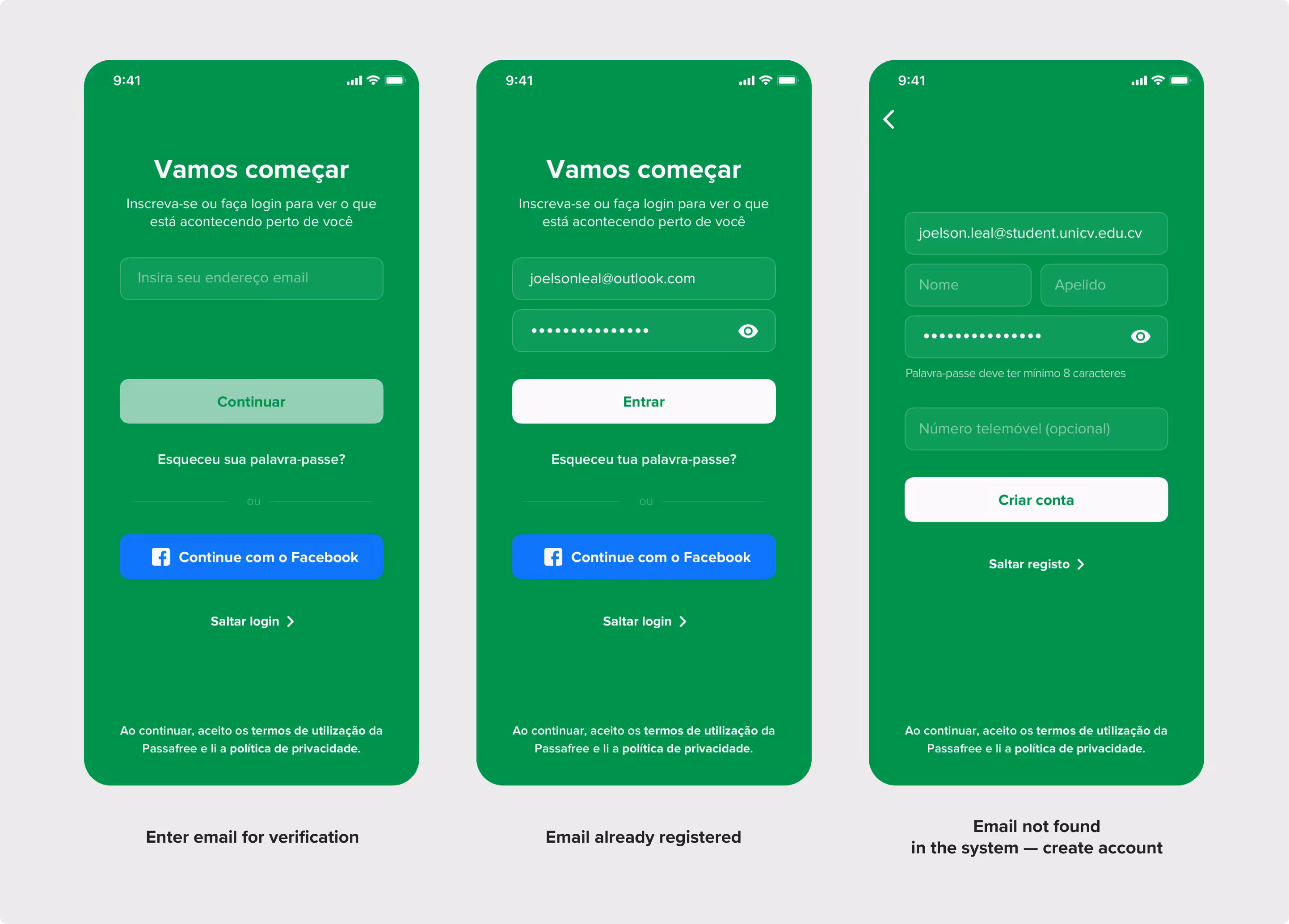
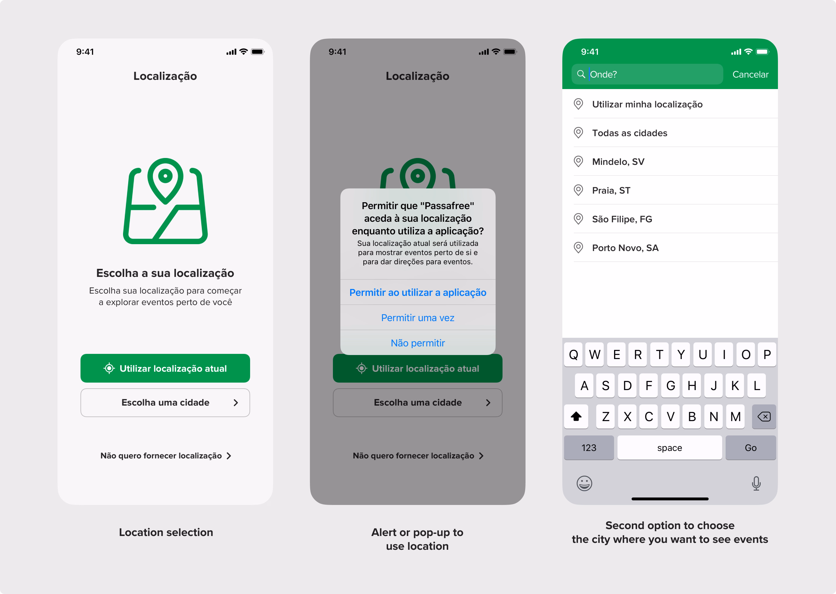
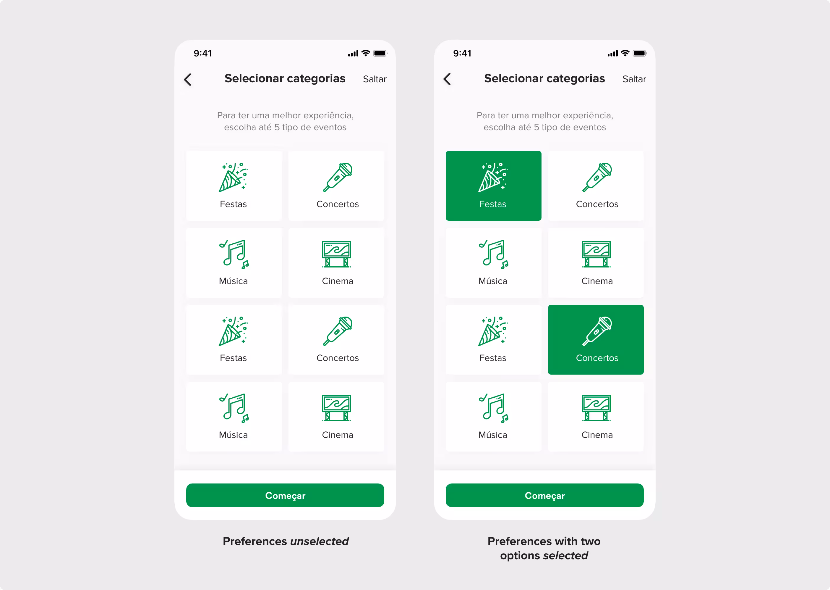
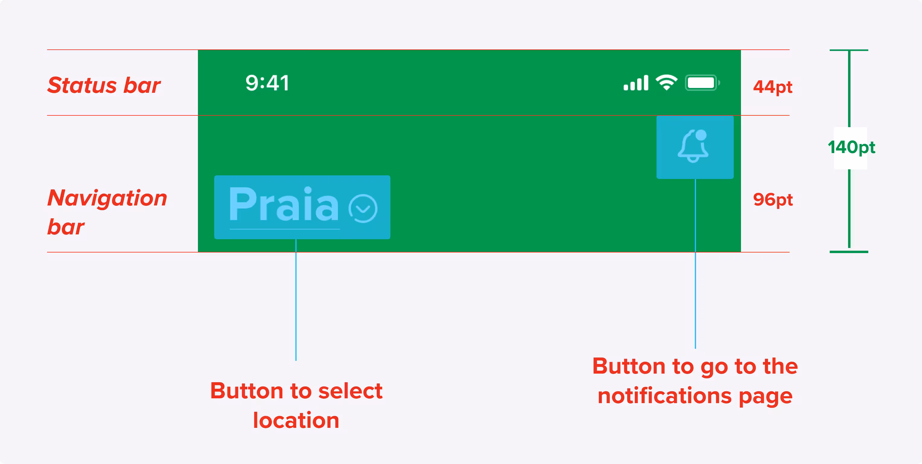
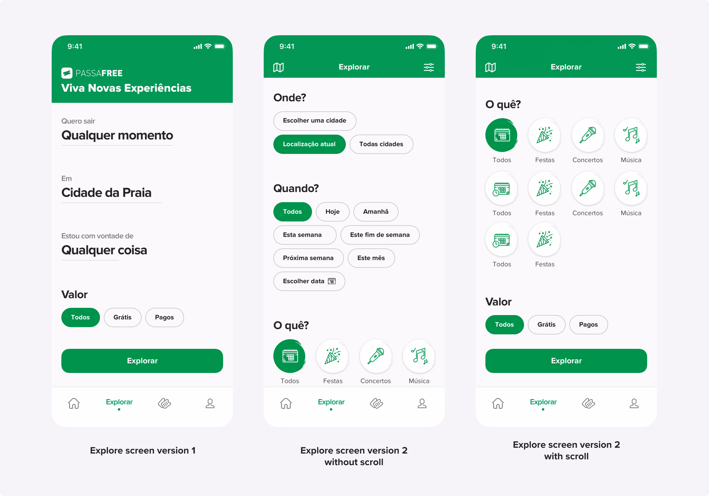
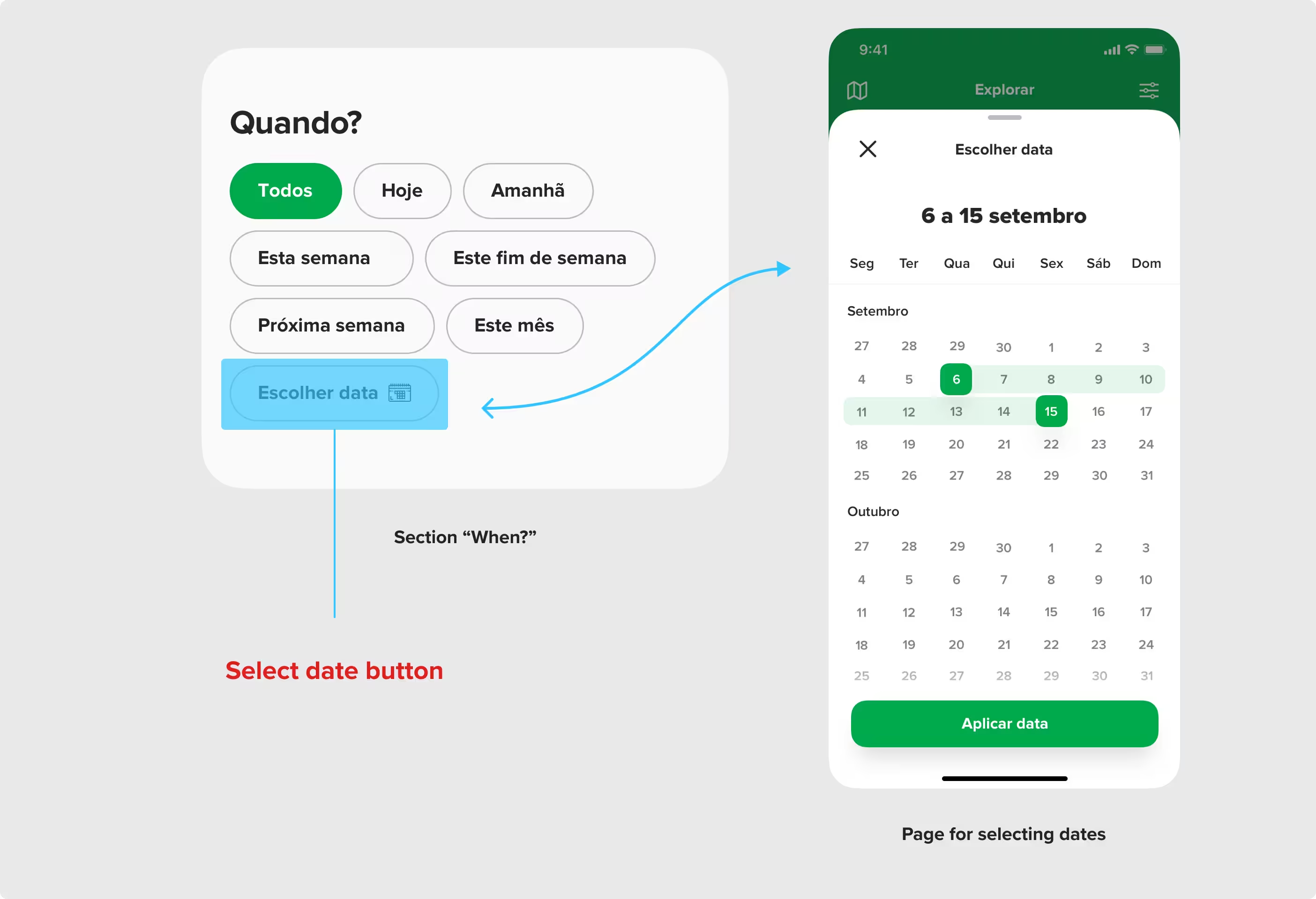
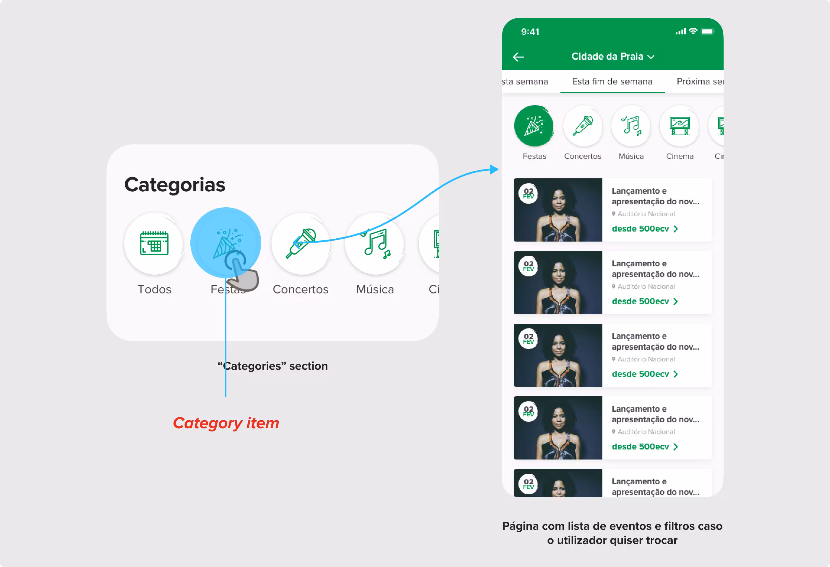
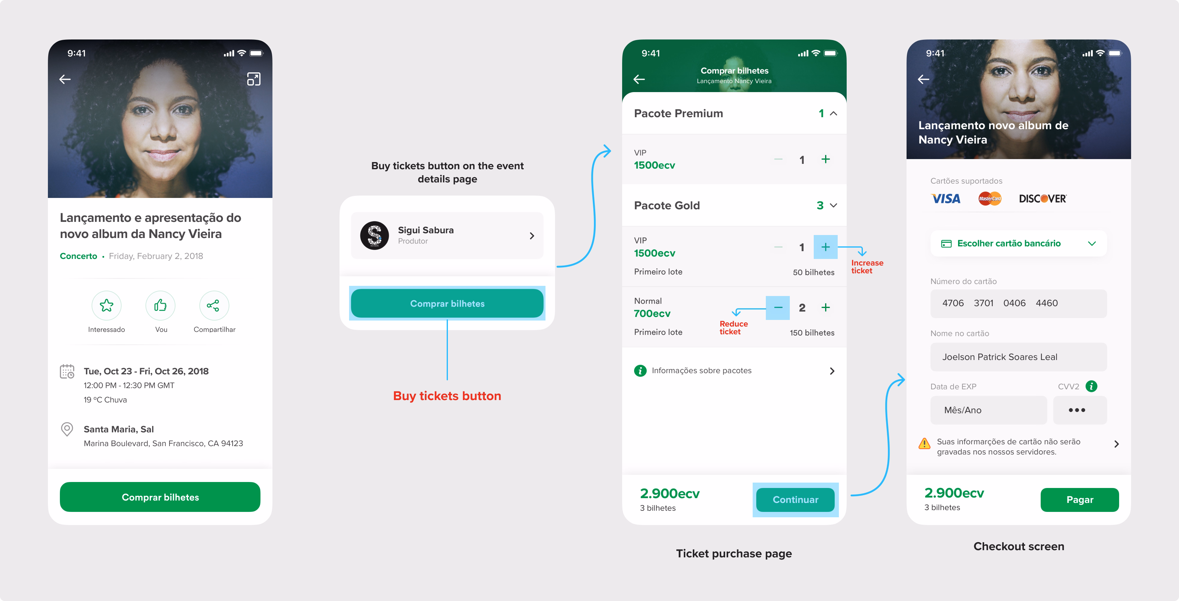
Each screen was designed based on the functional requirements prioritized by users in the research phase. We started with the login and onboarding flow, then moved into designing the core sections: Home, Explore, Tickets, and Profile. To support a better first-time experience, new screens were added to capture user location and event preferences. For each feature, we focused on simplifying interactions, aligning with iOS guidelines, and reducing friction. We also tested two layout options for the Explore screen and let users vote, bringing them directly into the design process. In total, over 50 screens were created to reflect real user needs, cover all key flows, and support a faster, clearer way to find and attend events.
Users asked for a faster setup and more relevant suggestions, so we added optional screens for location and event preferences, improving personalization from first use.
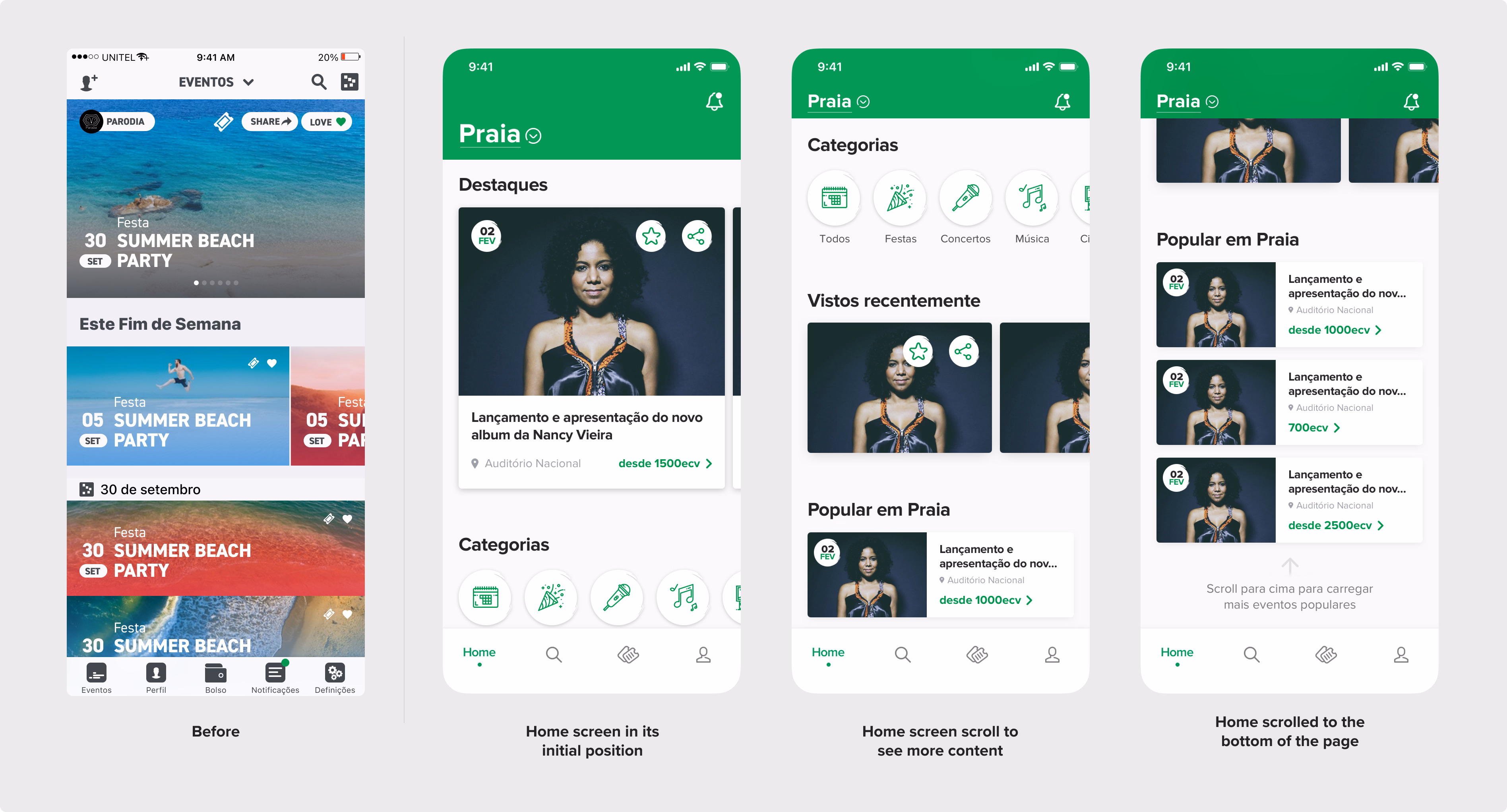
Based on complaints about poor filtering, we rebuilt the home screen with city, category filters, recently views events, and ticket price previews all surface upfront.

Users wanted better event discovery, so we introduced a redesigned Explore screen with multi-criteria filters (when, where, what, price), tested and selected through participatory design.
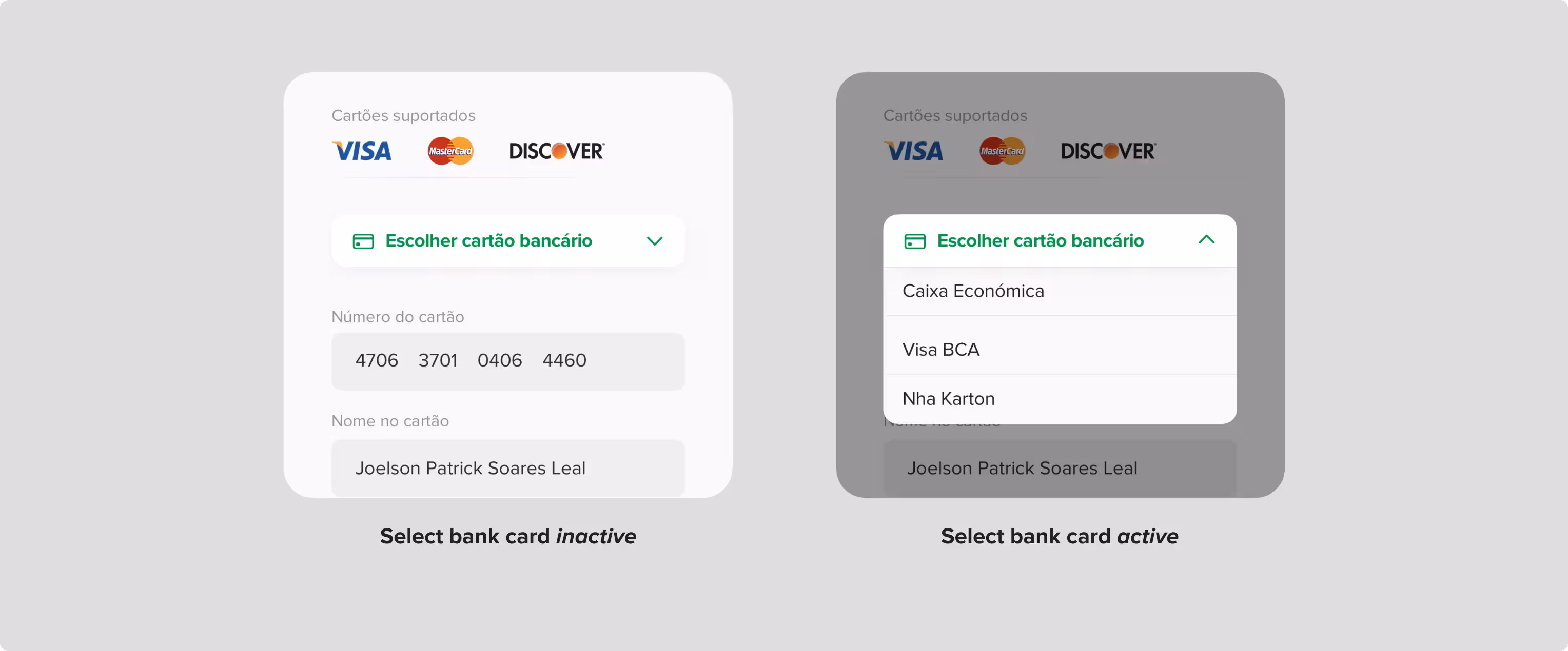
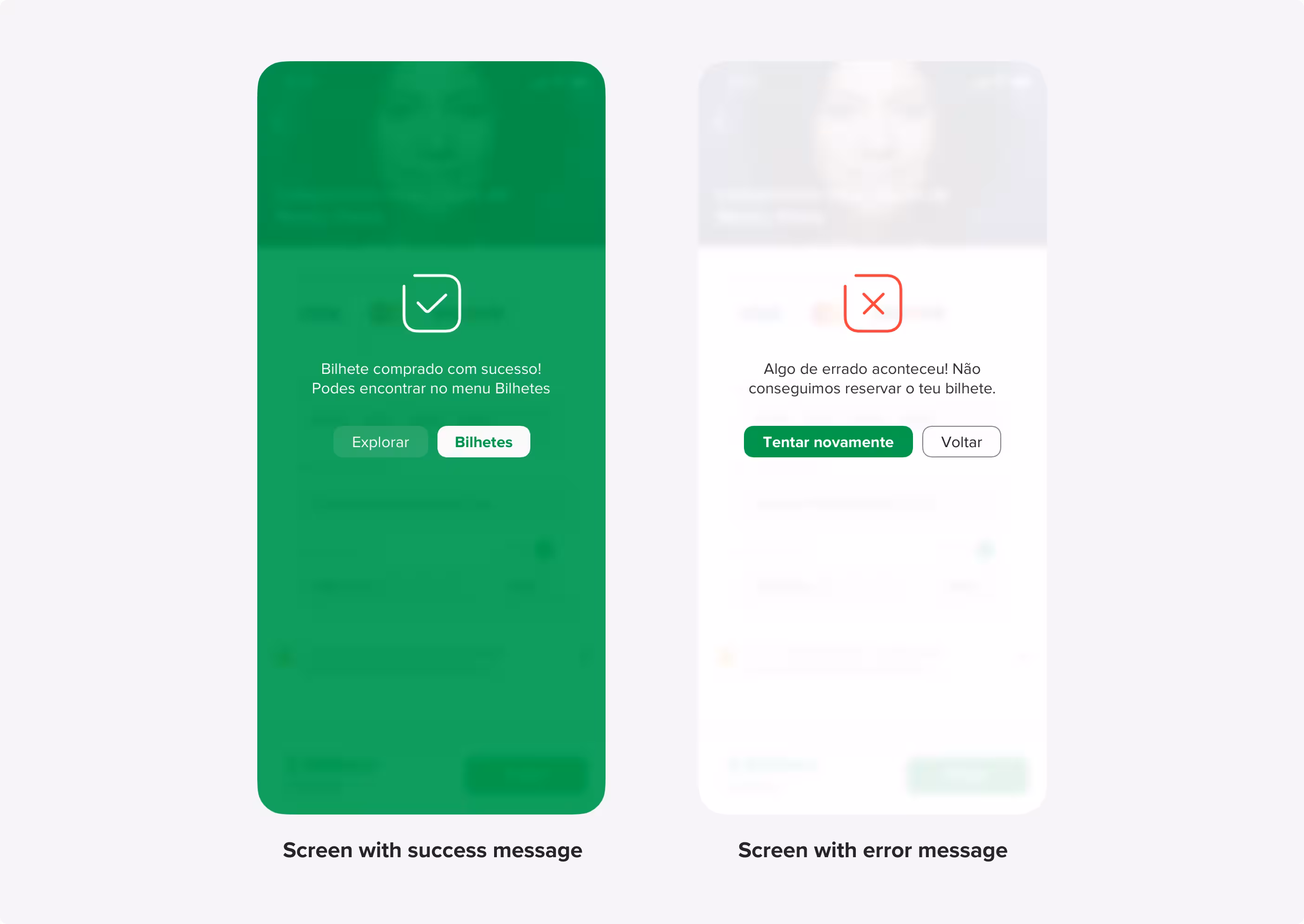
To reduce friction in the ticket buying process, we simplified navigation from the event checkout, added auto-filled payment for returning users, and clarified all CTAs.
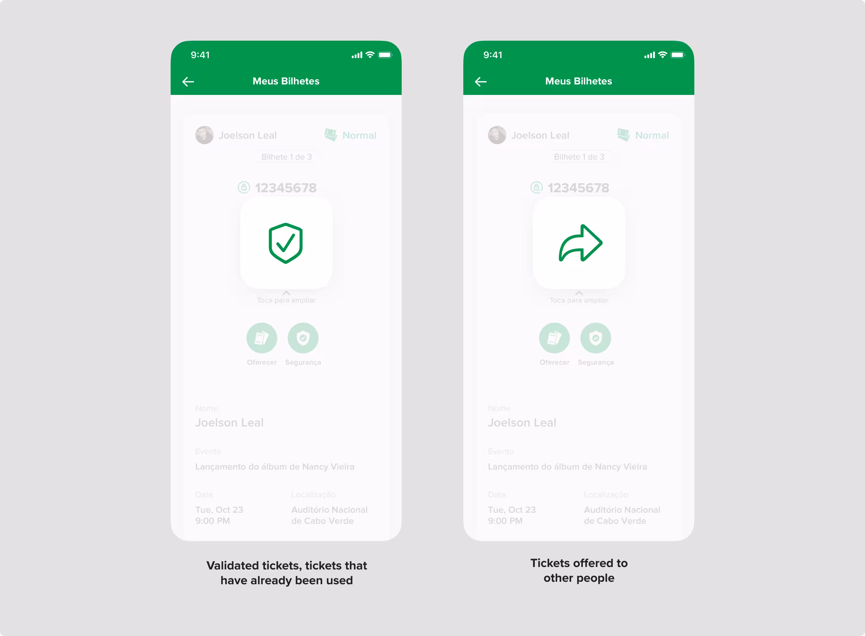
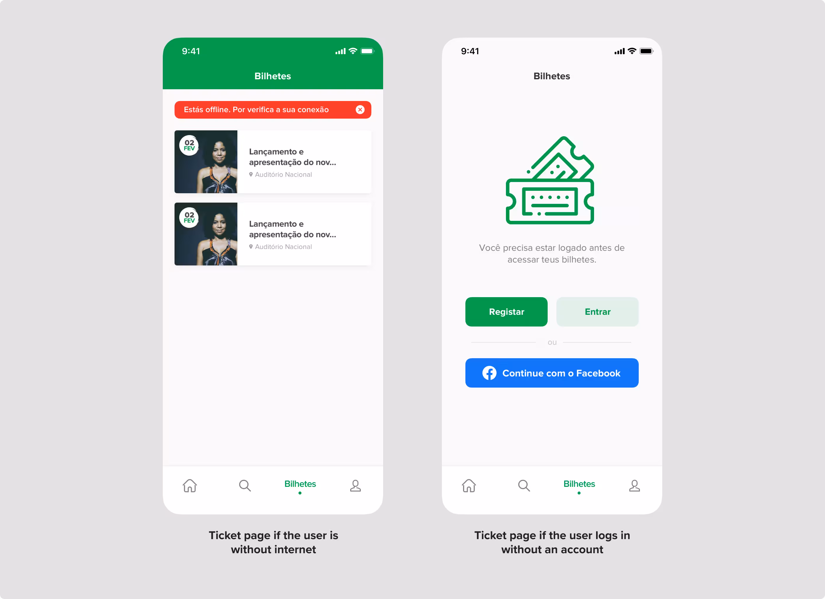
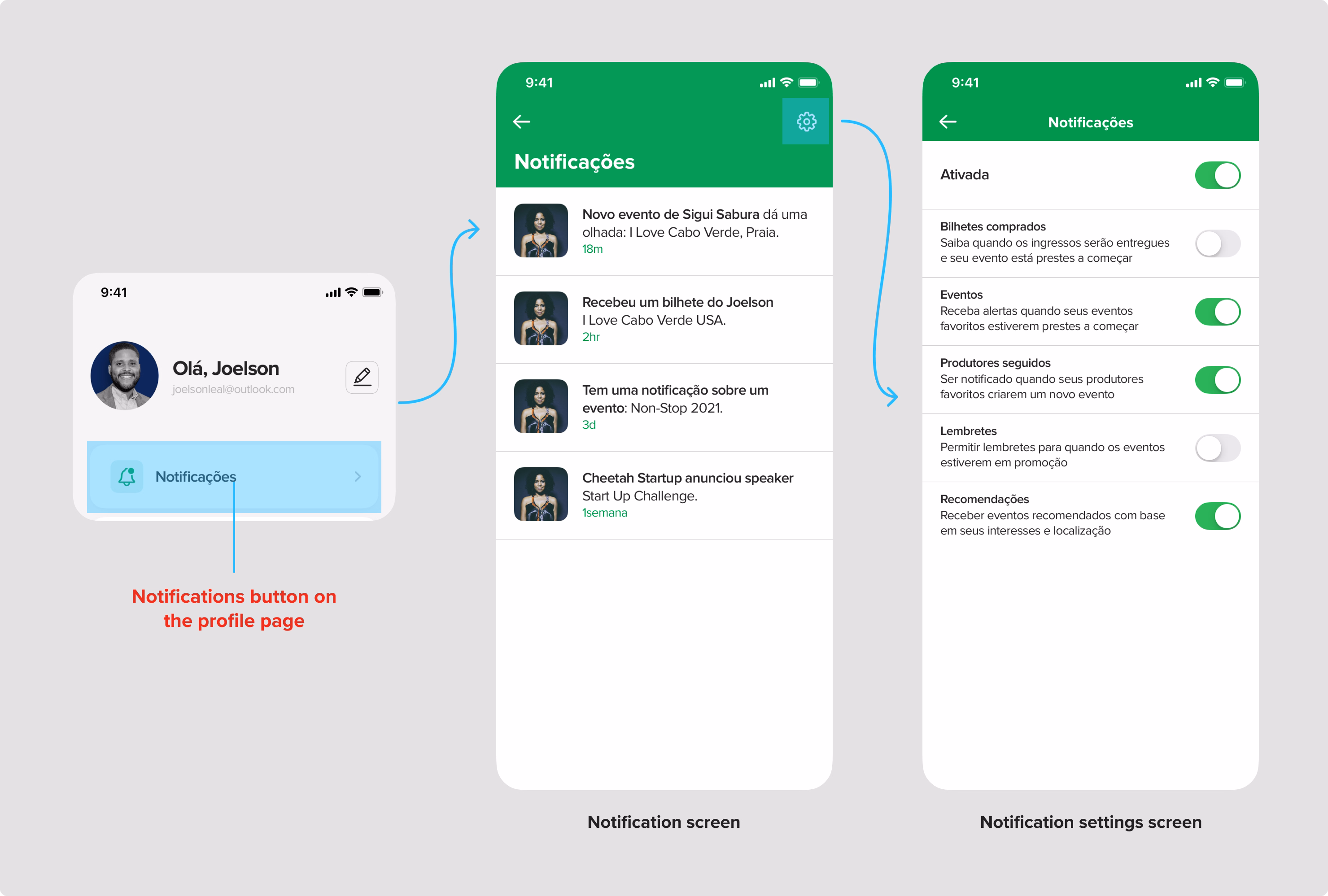
We added requests for offline ticket access, gifting, and notifications by redesigning the ticket screen and adding card-saving and notification controls under profile.
To assess the prototype’s effectiveness, a cognitive walkthrough was conducted with representative users performing three core tasks. Metrics such as task success rate, time on task, number of actions, and errors were recorded. All participants completed the tasks successfully, with acceptable times and minimal errors. The evaluation confirmed that the interface was intuitive, aligned with user expectations, and met the functional goals set during the research and design phases.
Applying a full user-centered design process, from user research to functional requirements, interface prototyping, and usability testing, proved essential in delivering a high-fidelity prototype that met real user needs. Heuristic evaluation and cognitive walkthroughs uncovered small but important usability improvements. Involving users throughout helped align product design with both business and user goals. While the prototype scored high across all metrics, the updated version was never released due to internal disagreements between founders, leading to the project's closure before launch. Still, the process validated how design grounded in real needs leads to better outcomes.