Decentralised identity in banking: accounts opened 4× faster
Opening a bank account in 3 minutes instead of 11. My MSc research on digital ID wallets people actually trust, published at CHI 2026.
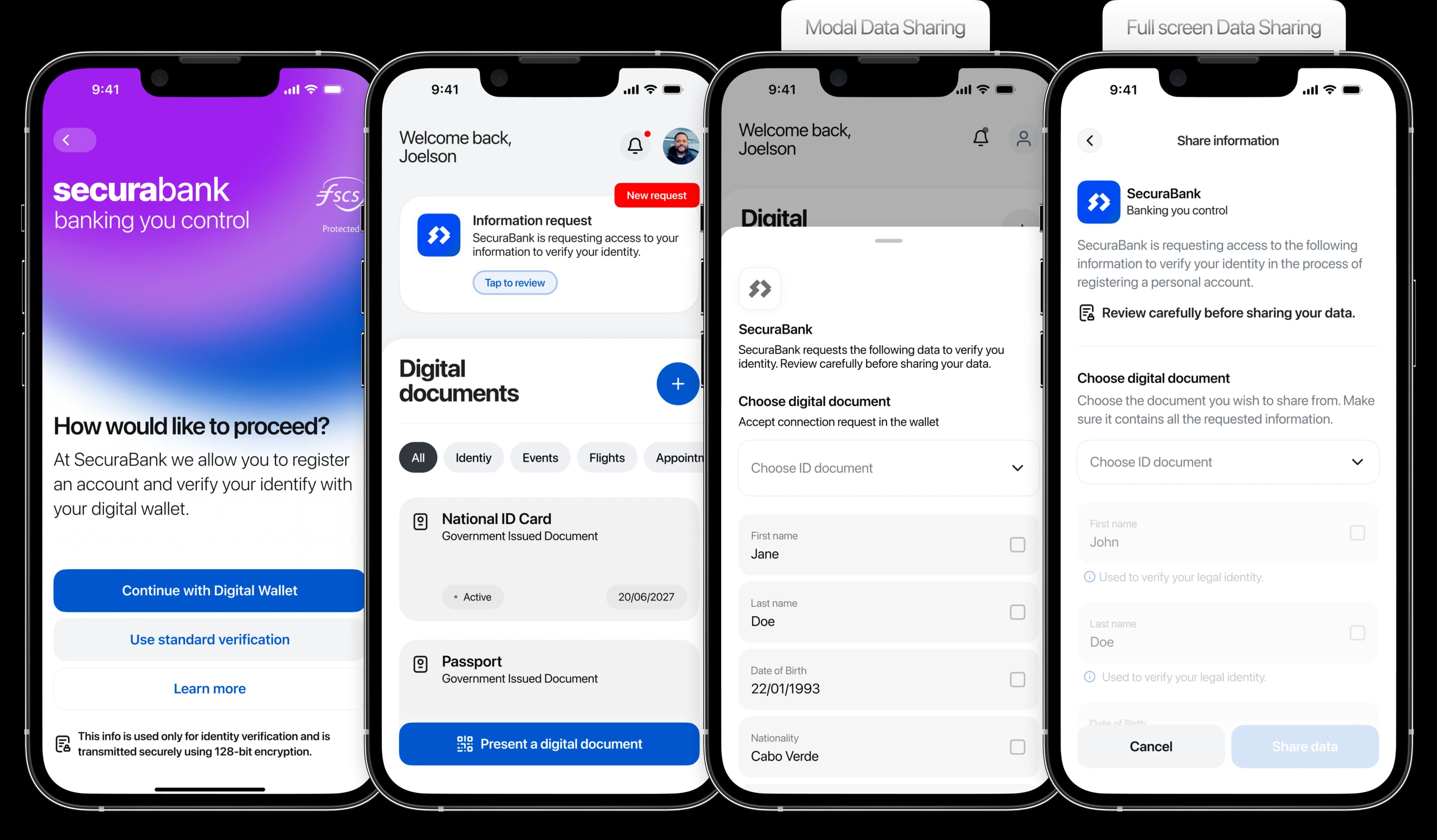
Overview
Impact
The DID flow won on every measure I looked at:
Opening an account took under 3 minutes with a digital wallet versus over 11 minutes the traditional way. Nearly 4× faster, because credential sharing eliminates repeated manual entry.
A SUS score above 85 is considered excellent; 71 is just acceptable.
Completed the DID flow without help, versus the traditional flow, and with roughly a third of the user errors.
On a 7-point trust scale. With 8 participants the difference isn't statistically significant, so I treat it as a signal, not proof.
The thesis added empirical evidence to a field that had almost none from a design perspective, and its principles now inform ID.CV, the decentralised identity protocol we're building on Cabo Verde's national domain. It also connects directly to my work at hello.cv: both are about designing systems people trust to act on their behalf.
Challenge
Can decentralised identity make bank identity checks easier and more trustworthy for non-technical people?
And what does the interface need to do to make that happen?
Decentralised identity (DID) works the other way around: your credentials live in a wallet you control, and you share only what's needed. But nobody had studied whether ordinary, non-technical people would understand and trust it in a banking context, from a design perspective. That gap became my thesis. The question also matters to me beyond academia, because it's the foundation for ID.CV, the identity layer we're building on .cv, Cabo Verde's national domain.
Status quo
I ran a heuristic evaluation of a typical current flow (a debranded prototype based on Coinbase's onboarding). It surfaced the usual problems: no sense of progress, repeated data entry, jargon like "KYC verification" instead of "identity check," and no way to pause and resume.
Process
A mixed-methods studyI designed with users, not for them.
I ran a co-design workshop with non-technical participants, mapping their journey through the current flow. The requirements came straight from them: tell me upfront what documents I need and how long this takes, show me where I am, stop asking me the same thing twice, and let me see what I've shared.
"Tell me upfront what documents I need and how long this takes."
"Show me where I am."
"Stop asking me the same thing twice."
"Let me see what I've shared."
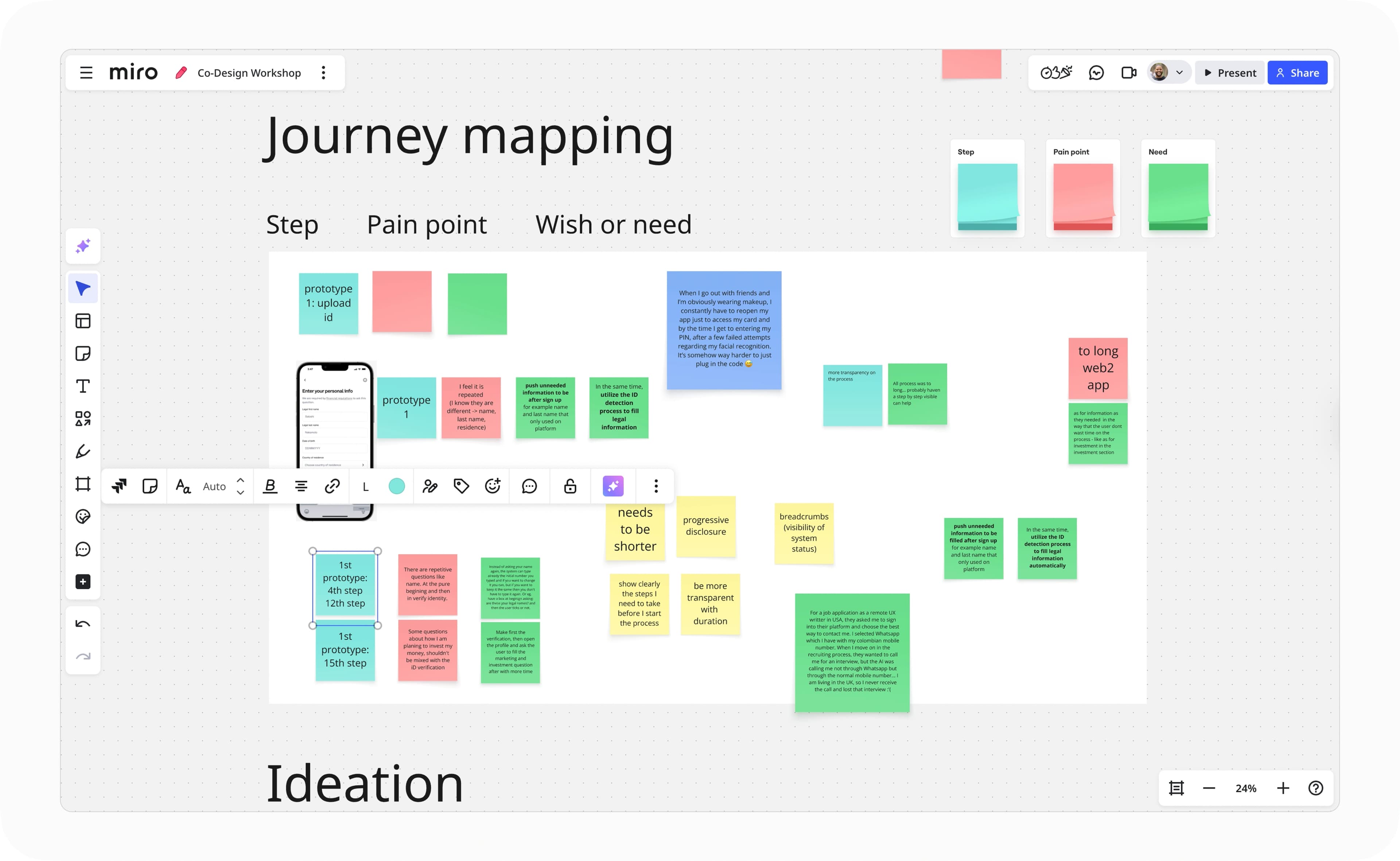
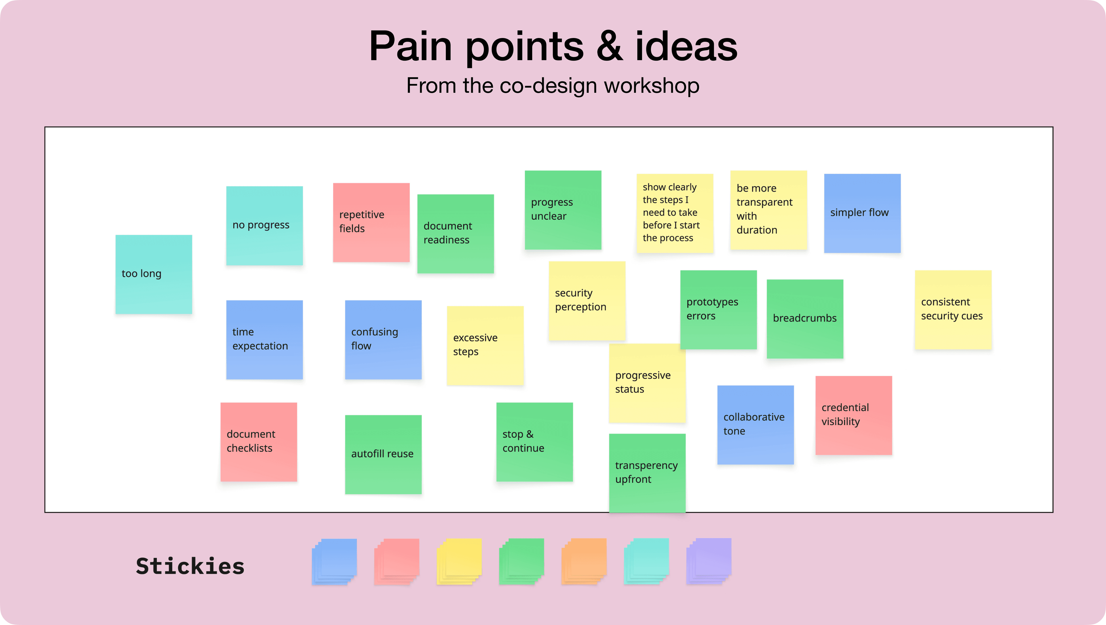
I built both versions.
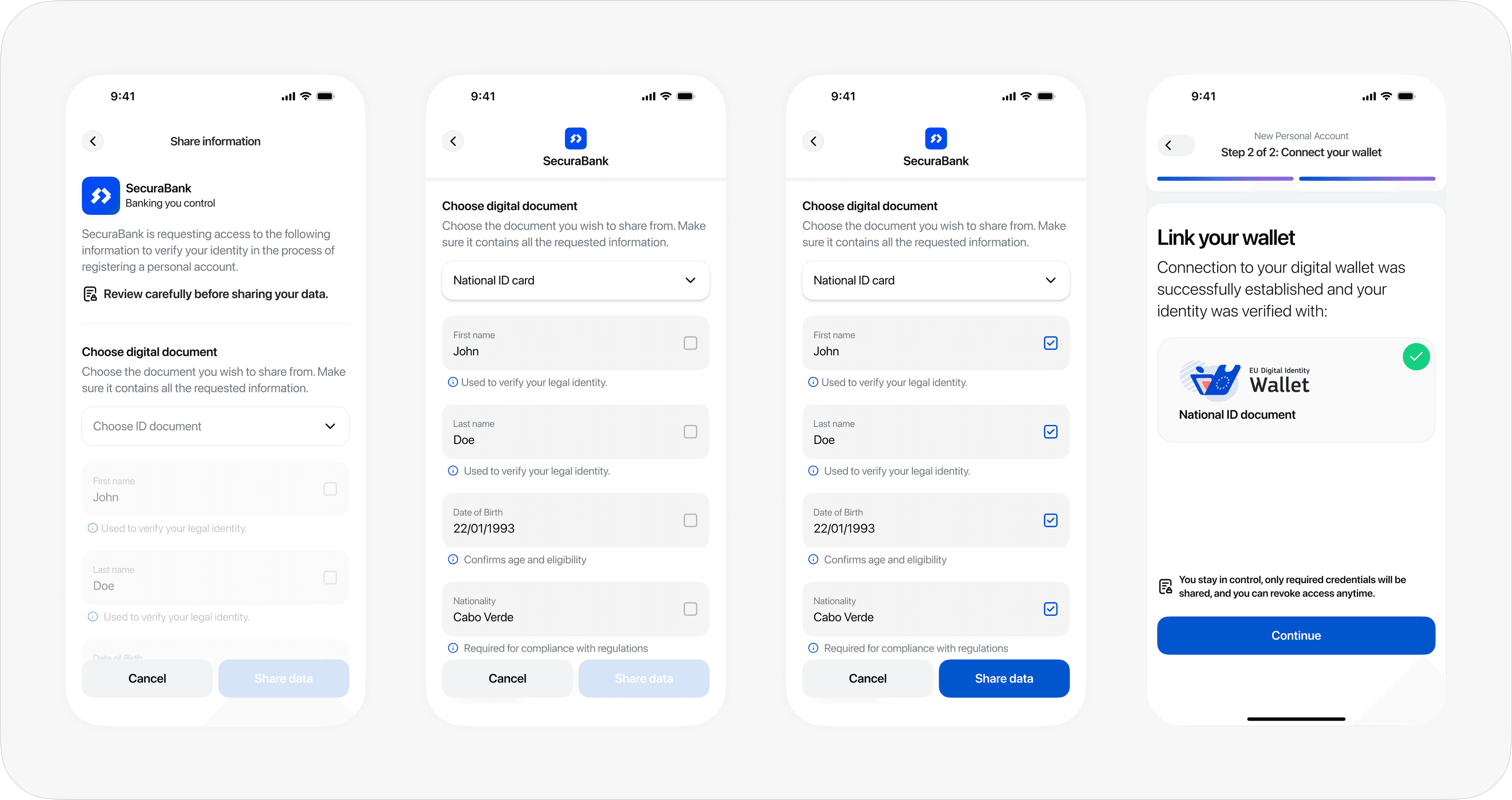
I built two high-fidelity, deliberately debranded prototypes in Figma and ProtoPie: "Chainkonnect," a standard email-password-upload-a-selfie flow, and "SecuraBank," where you verify by connecting a digital ID wallet and approving exactly which credentials to share.
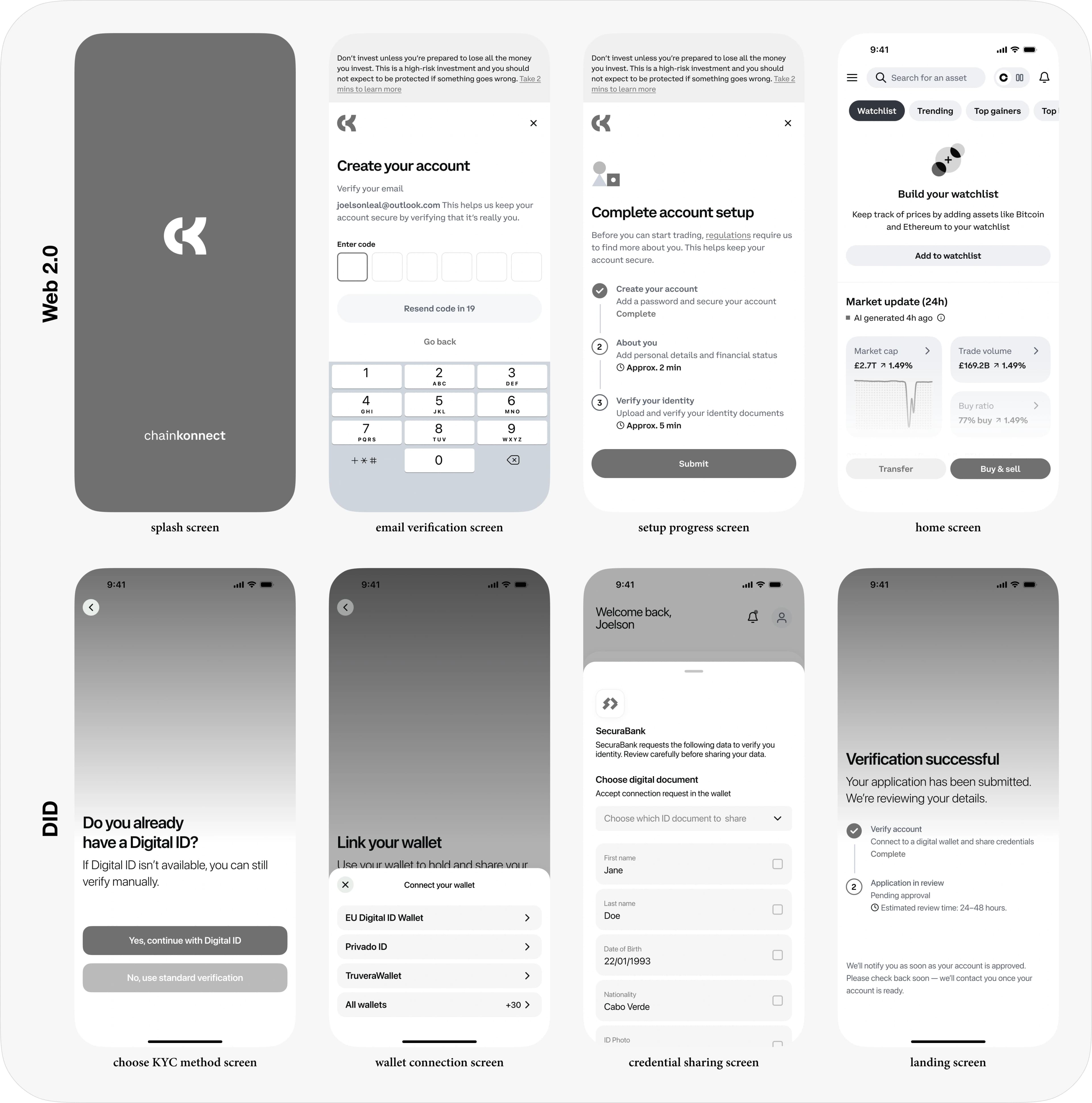
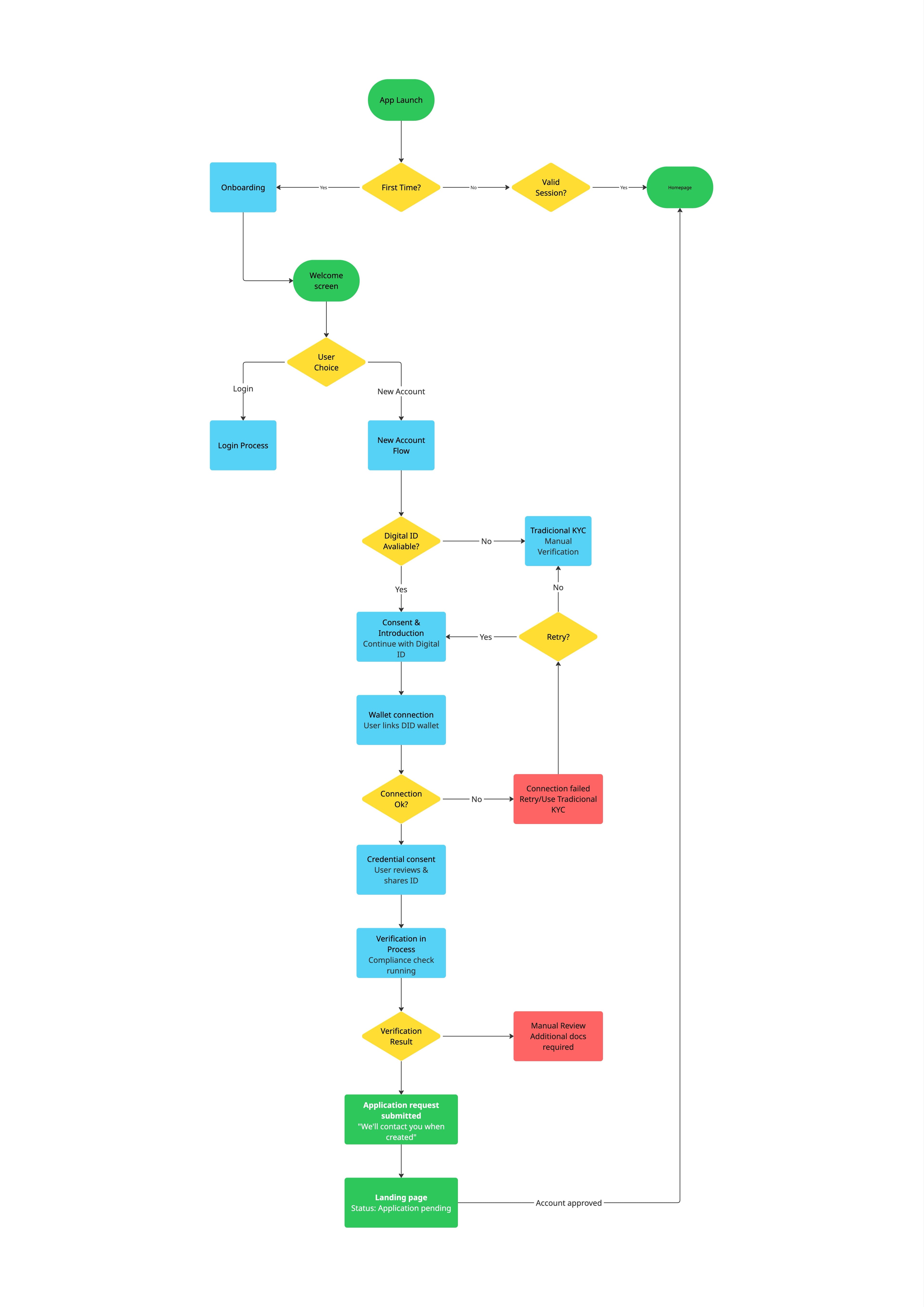
I tested them against each other.
A controlled, counterbalanced within-subjects study: 8 participants, technical and non-technical, each opening an account in both flows. I measured completion, time, errors, perceived usability (SUS), trust, and mental workload (NASA-TLX), plus think-aloud sessions and interviews.

Solution
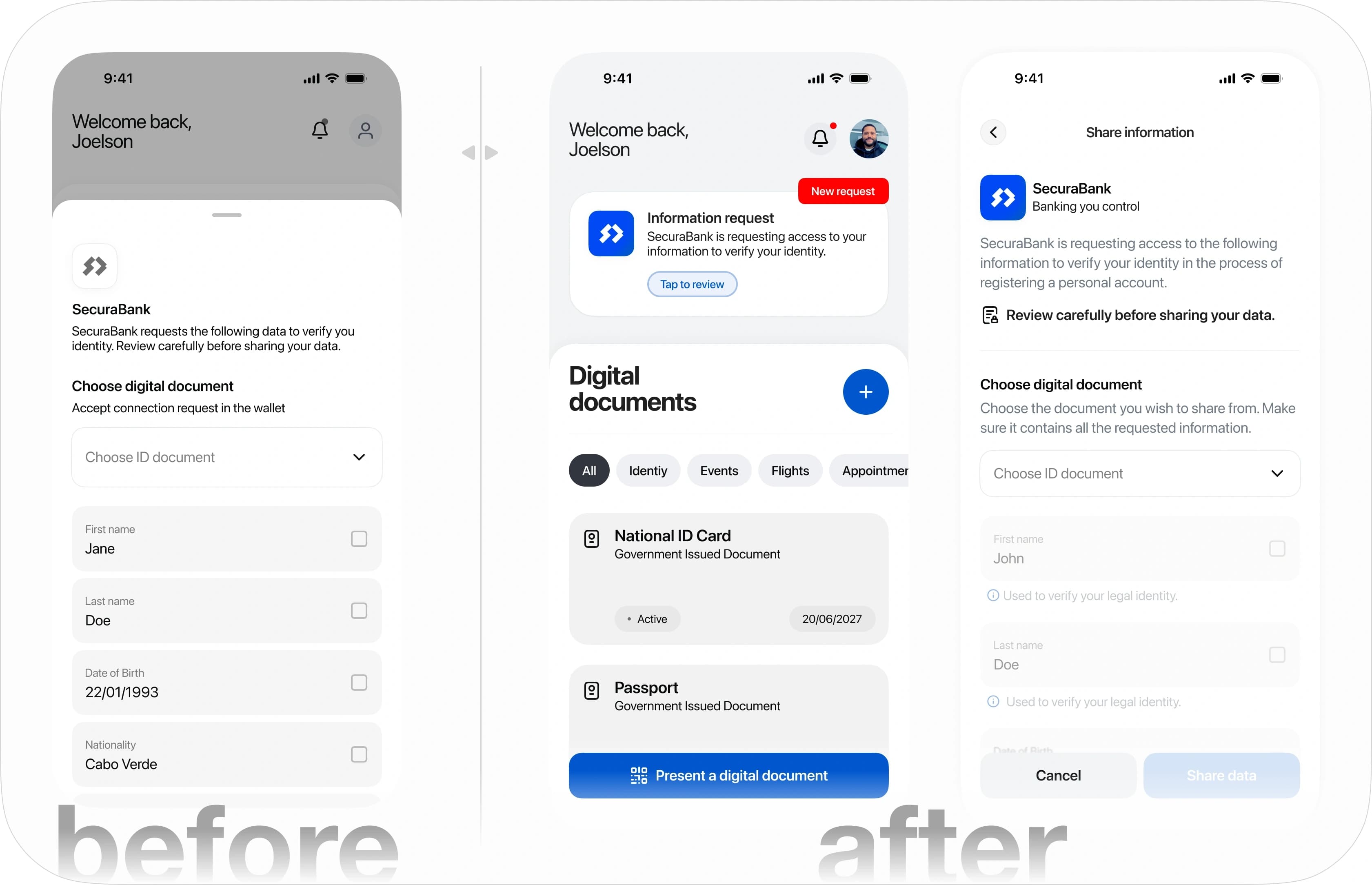
I translated the findings into four principles (transparency, efficiency, usability, trust & security) and rebuilt the DID prototype around them:
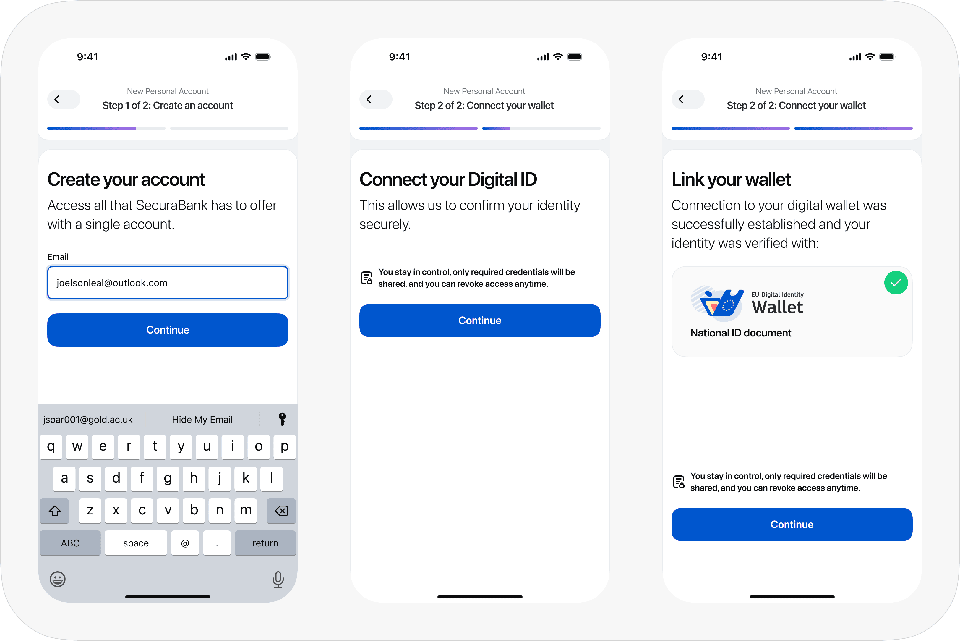
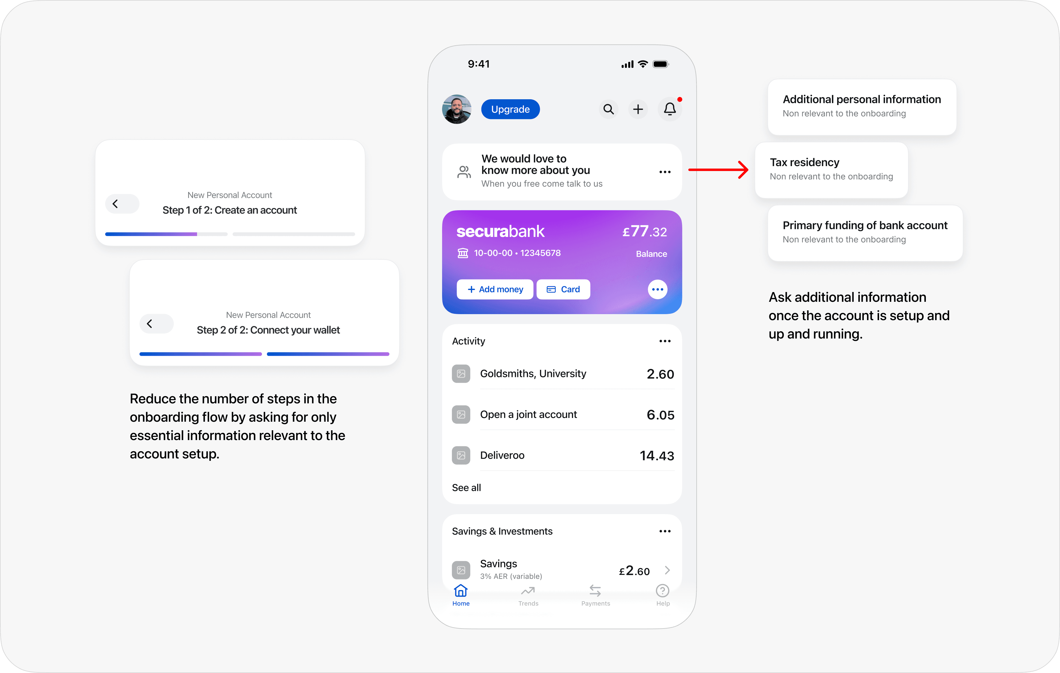
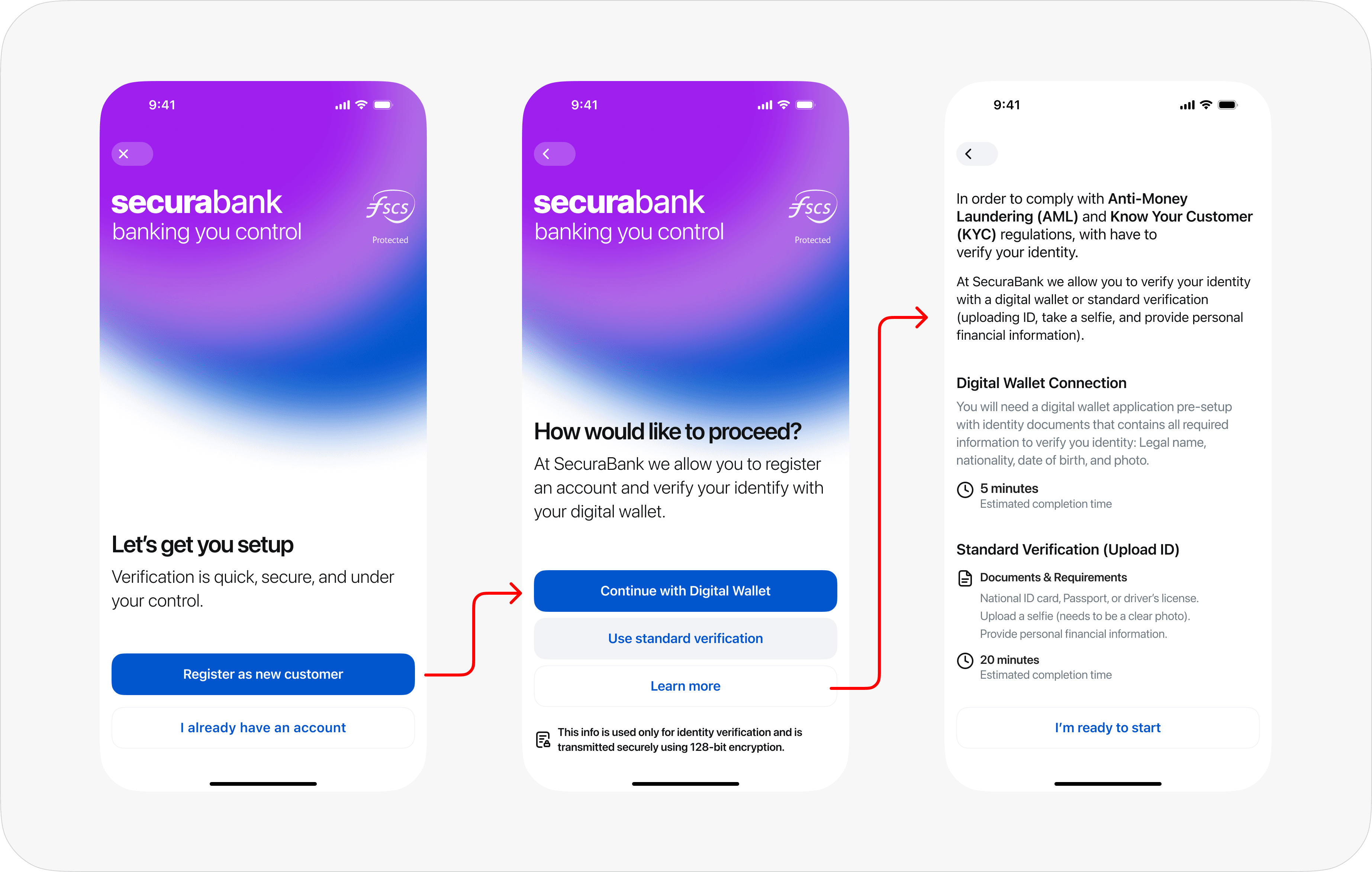
No sense of progress, repeated data entry, jargon like "KYC verification" instead of "identity check," and no way to pause and resume.
Visible progress, visible credentials, plain language about what's shared and why.
Learnings
The finding I keep coming back to: some participants read the long, painful traditional flow as a sign of security. Friction felt like protection. So simplifying identity verification isn't enough. If you remove the friction, you have to replace the reassurance it was accidentally providing. Trust has to be designed into the interface deliberately: visible progress, visible credentials, plain language about what's shared and why. A secure backend means nothing if the interface doesn't show the security.
I'd recruit compliance professionals, not just end users. My planned expert review didn't get responses within the study window, and regulatory reality is where DID adoption will actually be decided. I'd also test with more than 8 participants: every result pointed the same direction, but I'd want the statistical power to match the effect sizes.